
Case Study: Granite Gorge Mountain Park
A Mountain Park Website Built for Real Growth
How a full brand overhaul, new site architecture, and smarter content strategy gave Granite Gorge a peak digital presence.
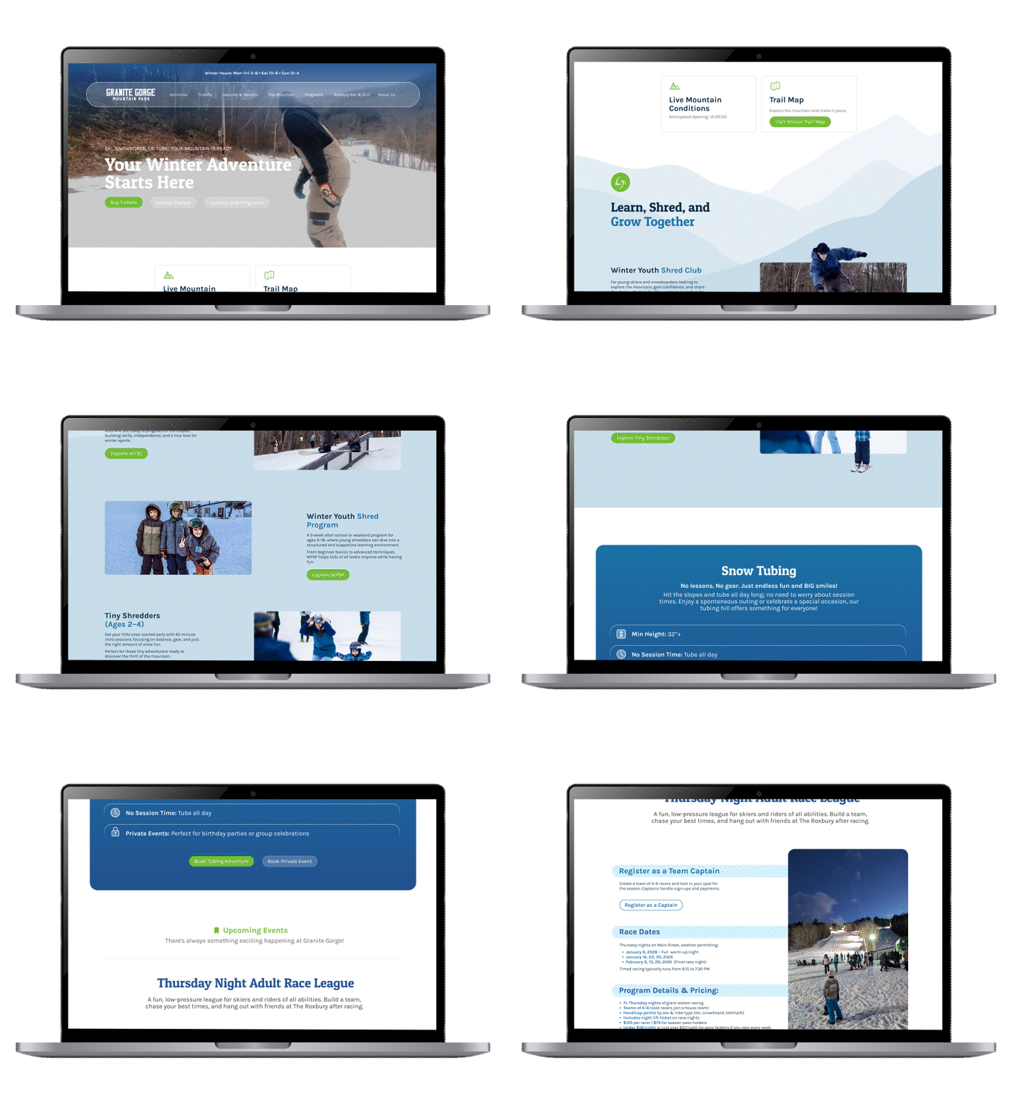
We started from scratch and built something their team could actually own and grow.
About the Client
Granite Gorge Mountain Park is a family-owned ski area and mountain park in Keene, NH, the only local mountain offering both alpine skiing and dedicated tubing terrain. With 17 acres of skiable terrain, beginner-friendly slopes, and an expanding summer program that includes mountain biking and seasonal events, they serve outdoor enthusiasts of all ages across Cheshire County and surrounding areas in Vermont and Massachusetts.
The Challenge
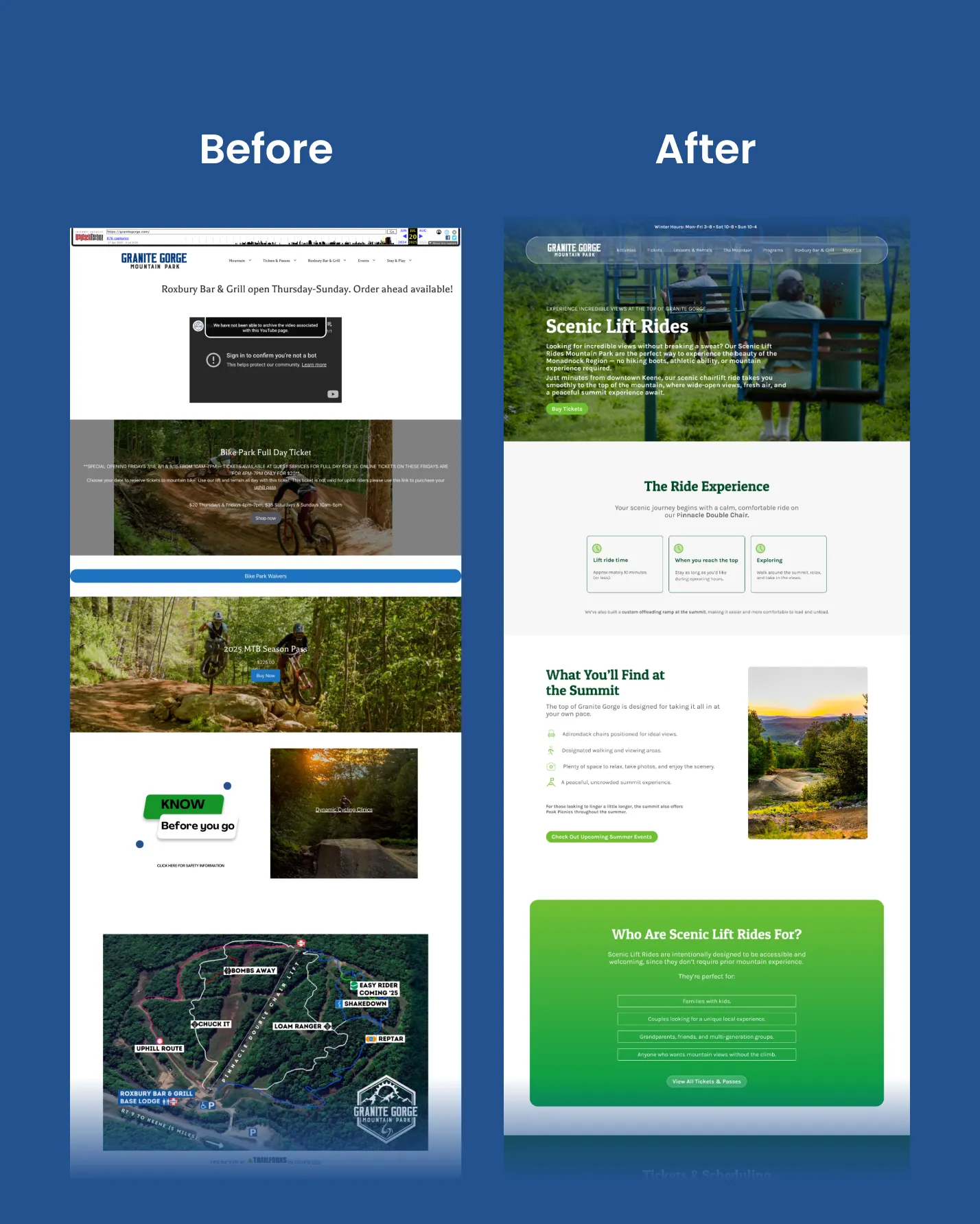
When Granite Gorge came to us under new marketing leadership, their website was the single biggest obstacle to growth. A third-party vendor still held ownership of the site, meaning no updates, no SEO improvements, and no operational changes could be made without going through them. And the site itself had serious problems:
-
Cluttered layouts with too much scrolling and no clear visual hierarchy
-
No consistent brand identity: fonts, colors, and tone varied from page to page
-
Seasonal content switching was broken, creating dead links and missing information
-
Poor mobile experience across key pages
-
No way to sell tickets online, control parking capacity, or let visitors sign waivers digitally
- Low local awareness: many potential visitors in the area didn’t even know the mountain was open
The site wasn’t just outdated. It was costing them visitors and revenue every single day.
What we did
1. Brand Identity First
Before touching the website, we built the visual foundation. Our design team developed a full brand guideline (including color palette, logo variations, iconography, and UI component specs) that standardized everything. Their internal team now has a document they can reference to keep things consistent going forward.
2. Defining the Voice
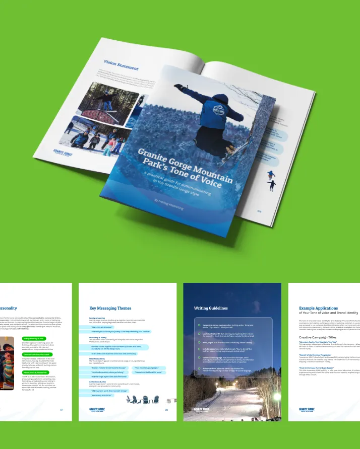
At the same time, our content team developed a Tone of Voice guide that defined how Granite Gorge communicates across every touchpoint. That guide shaped all the website copy and became a resource for everything they create going forward.
3. A Smarter Site Structure
With the brand and voice in place, our SEO team redesigned the full site architecture from scratch. The goal: fewer clicks to get to critical information, a navigation structure that actually made sense, and a layout that could shift cleanly between ski season and mountain bike season without breaking anything.
That meant reducing navigation depth so high-value content was reachable in one or two clicks, building a seasonal mode system that kept year-round content always accessible, replacing text-heavy pages with image-led layouts, and making sure every conversion path (ticket purchases, pass info, waivers, contact) was easy to find and complete.
4. Copy That Matched the New Brand
Our content team rewrote the website copy from the ground up, replacing cluttered and outdated text with messaging that actually communicated what makes Granite Gorge worth visiting: local, affordable, beginner-friendly, and open year-round. Key pages, including the About, History, and Mission sections, were rebuilt to tell a real story and set GGMP apart from the larger resorts competing for the same audience.
5. Functional Integrations That Actually Work
Our dev team also solved the operational gaps the old site couldn’t touch: online ticketing with parking capacity controls, a merchandise storefront, digital waiver signing, and a CMS that lets the Granite Gorge team manage and update their own content without calling anyone.
The Results Across Q1
When the new site launched, Granite Gorge went from having a website that blocked growth to one that actively supported it. Visitors can now find what they need quickly, buy tickets without friction, sign waivers before they arrive, and browse seasonal programming without hitting a dead end.
In practical terms, that means fewer phone calls to answer basic questions, fewer abandoned visits because the site was confusing, and a brand that now looks and sounds like the mountain it represents.
What changed at launch:


The Takeaway
A website is often the first and only impression a potential visitor gets before deciding whether to show up. For Granite Gorge, that first impression was actively working against them. The fix wasn’t just cosmetic: it required rebuilding the brand, the voice, the structure, and the functionality from scratch.
The result is a site that works as hard as the mountain does: clear, welcoming, easy to navigate, and built to convert a first-time visitor into someone who shows up, buys a ticket, and comes back next season.

Our Work in Focus
Discover more

Cape Cod - Mosquito Squad
Paid Media Management

Premier Hoops
Website Design | Development

The Keene Axe House
Search Engine Optimization
What Our Clients Say
Success Through Collaboration

Unlike some larger agencies that push generic content, the team at Wunderkind is passionate about communicating the brand promise of their customers.
Ben Robertson | Menadena
They are very hands on and stay up to date on what is happening at our shop.
April Reynolds | Norm's Ski & Bike
They invest and care in the customer's story and want to make sure each company stands out.
Melissa Register | Register Family Farm
get in touch
Let’s start working together!
Give us a call or drop your email, and we’ll reach out to you.
(603) 352-5600 | [email protected] | 310 Marlboro St Suite 262, Keene, NH